
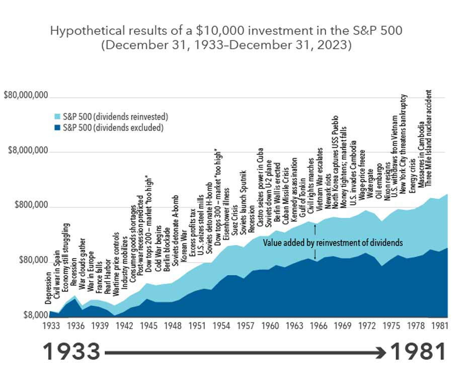
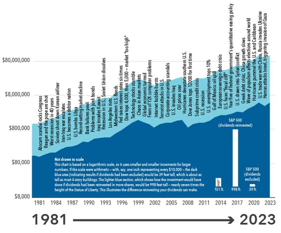
I’m sure you don’t spend your days gazing at long-term stock market charts. But it’s worth a quick look at these two linked charts, which together encapsulate the history of the stock market and put it into perspective.
I’m sure you don’t spend your days gazing at long-term stock market charts. But it’s worth a quick look at these two linked charts, which together encapsulate the history of the stock market and put it into perspective.
The charts trace the performance of the S&P 500 dating back to the latter stages of the Great Depression. Two dynamics stand out. The first is the sometimes jagged, but steady climb in the index over time. The second is the long list of troubling events. Some were genuinely era-defining and occasionally even catastrophic, such as the attack on Pearl Harbor and the U.S. entry into World War II. Many others ended up being comparatively self-contained even though they felt momentous at the time.
The lesson I draw from these charts is straightforward. There have always been supposed reasons not to invest — heated political clashes, economic setbacks, or societal upheaval— and yet the market overcame all of these obstacles amid economic growth and technological innovation. Of course, the past is not a prologue, and there’s no guarantee for the future.
But charts like this show that long-term investors have had markets on their side. Some people try to do better than the chart by reducing their holdings at what they think are peaks and adding at what they think are troughs. It sounds like this should work, but in practice, these people often do worse than those who just buy, hold, stay put, and make themselves content with the idea of getting the whole chart.
If you have questions about your investment plan, please reach out. If someone you care about has questions, please share my contact info with them. I’m always happy to help.